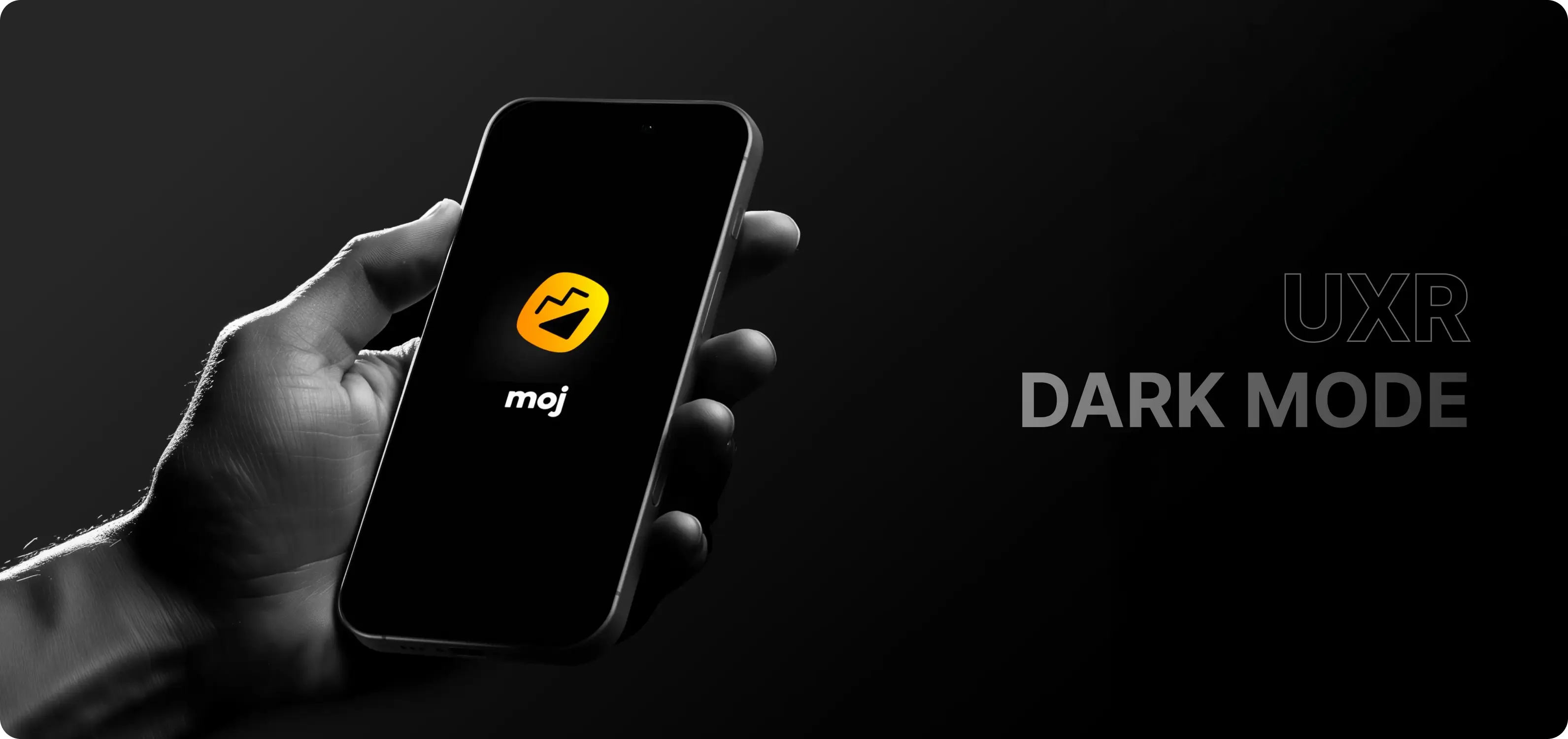
Dark Mode - Research
My research on Defining Primitive and Semantic Design Tokens for a Short-Video Social Media App
Challenge
The primary challenge was to address the lack of a standardized design system, specifically regarding color usage. The existing interface suffered from inconsistent implementations, making the introduction of a Dark Mode difficult.
Impact
Over 40M users India wide received an updated Moj App experience
Company

Overview
This research aimed to establish a robust foundation for the app's visual language. The goal was to move away from arbitrary color choices and define a comprehensive set of Primitive and Semantic Design Tokens. This ensures a scalable, cohesive, and accessible Dark Mode experience for users.
Problem Statement
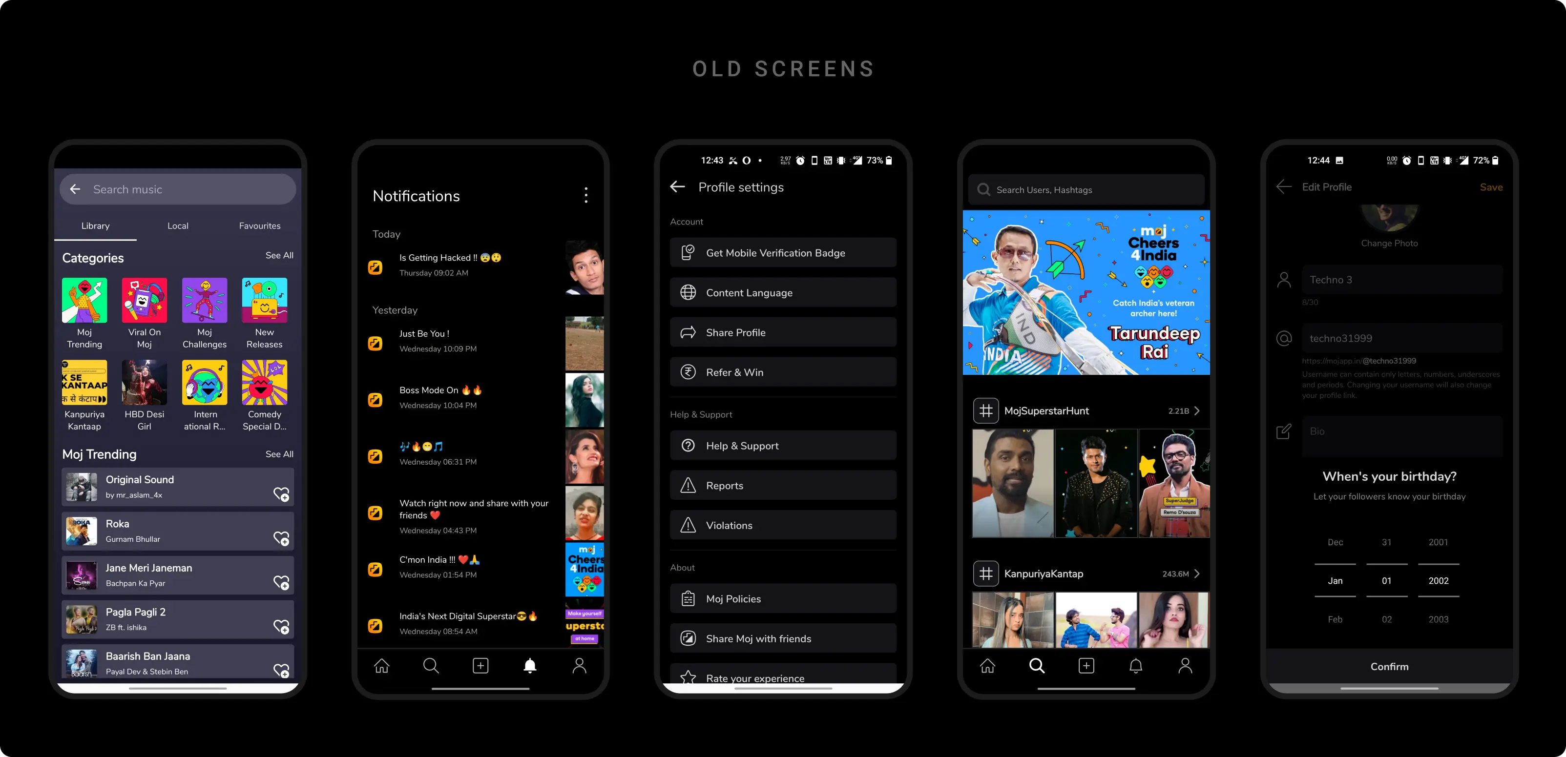
Inconsistent Pallet
The application previously relied on an unpredictable palette. Without a centralized system, designers and developers used varying shades of grays and blacks, leading to a disjointed user interface and visual fragmentation.
Factors associated with Dark Mode
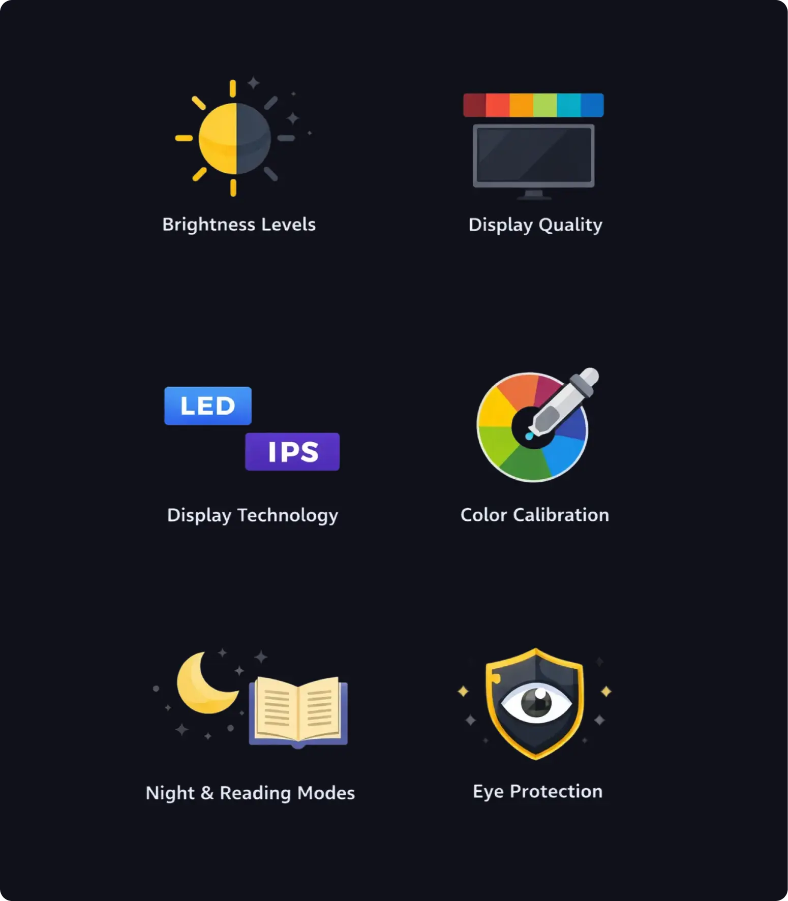
Designing an accessible and consistent dark mode is challenging due to wide variations in device brightness, display quality, color gamut, display technologies, and inconsistent color calibration.
These differences are further affected by OS-level features like night mode, reading mode, and eye protection settings, which alter color perception and contrast. The challenge is to create a dark mode system that remains legible, accessible, and brand-consistent across this fragmented device and display ecosystem.
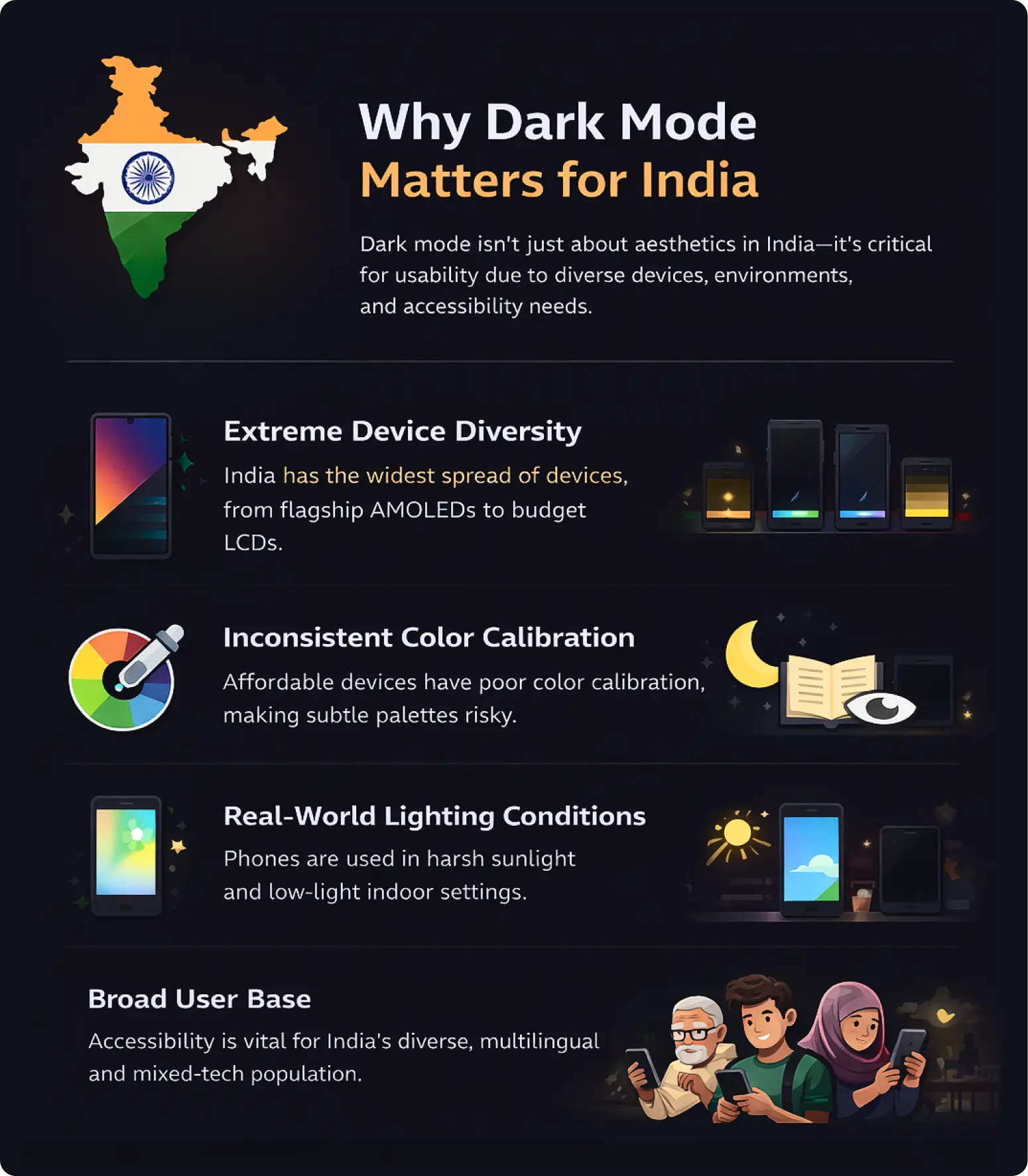
Why this research matters?
- India has extreme device diversity, from premium AMOLED phones to low-cost displays.
- Budget devices often suffer from low brightness and poor contrast.
- Inconsistent color calibration causes dark UIs to lose clarity.
- OS features like night and eye-protection modes heavily alter colors.
- Phones are used in harsh and unpredictable lighting conditions.
- Many users are first-time or non-power users who rely on clarity.
- Accessibility issues impact millions at scale in India.
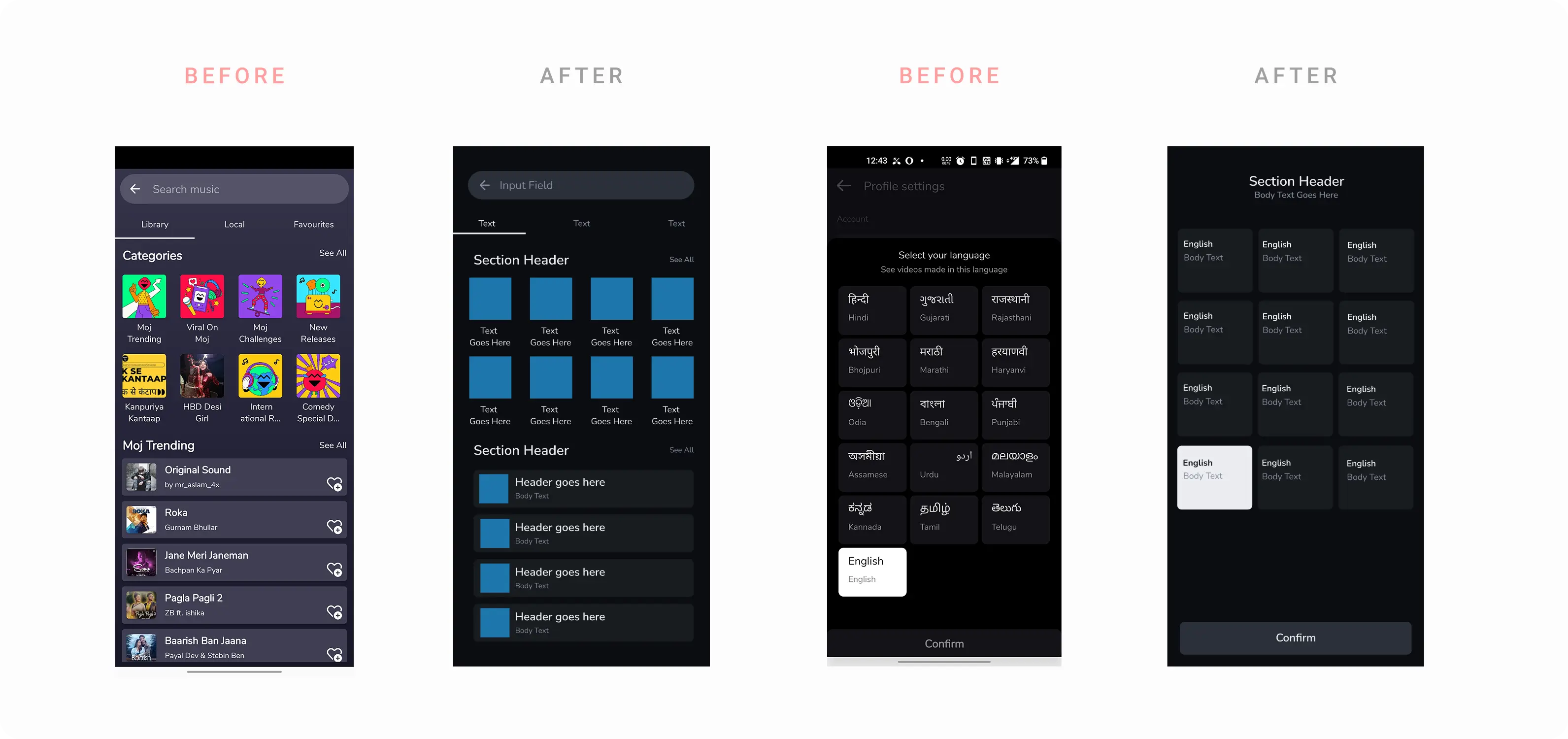
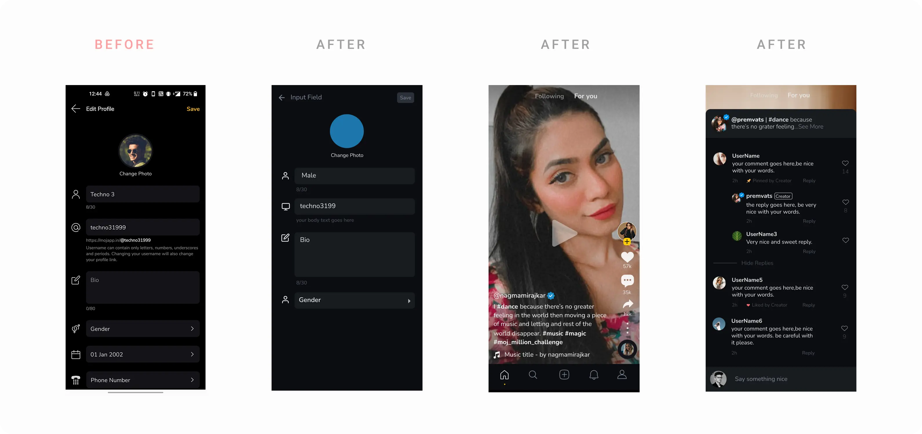
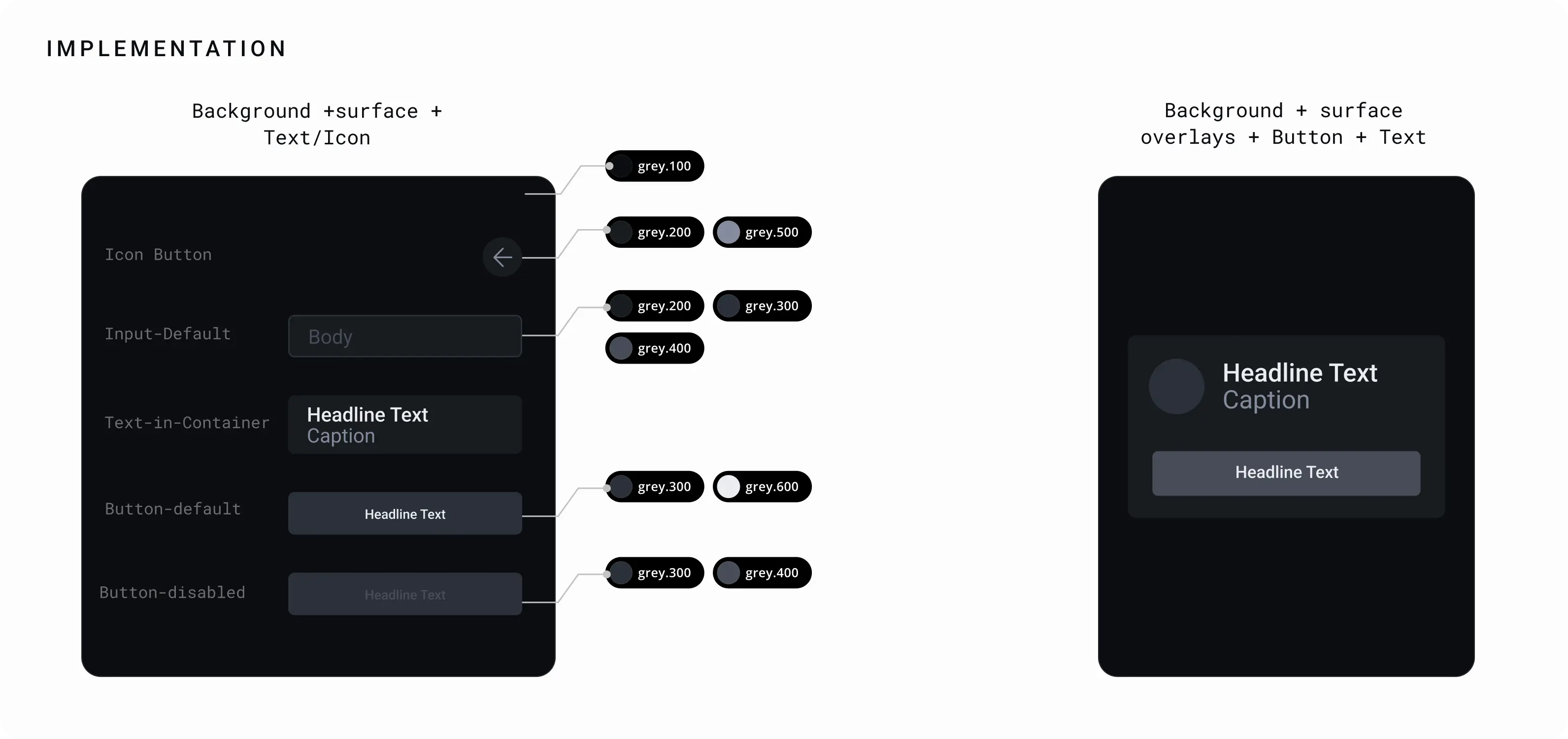
The process of defining the pallet
We started by doing audit of our existing screens to figure out the density of the token that is required (no. of surfaces, depth, complexity of visual element etc.)
Choosing the right accent
We evaluated brand colors to find the optimal saturation for dark surfaces. Standard brand colors often vibrate on dark backgrounds, so they must be desaturated or adjusted.
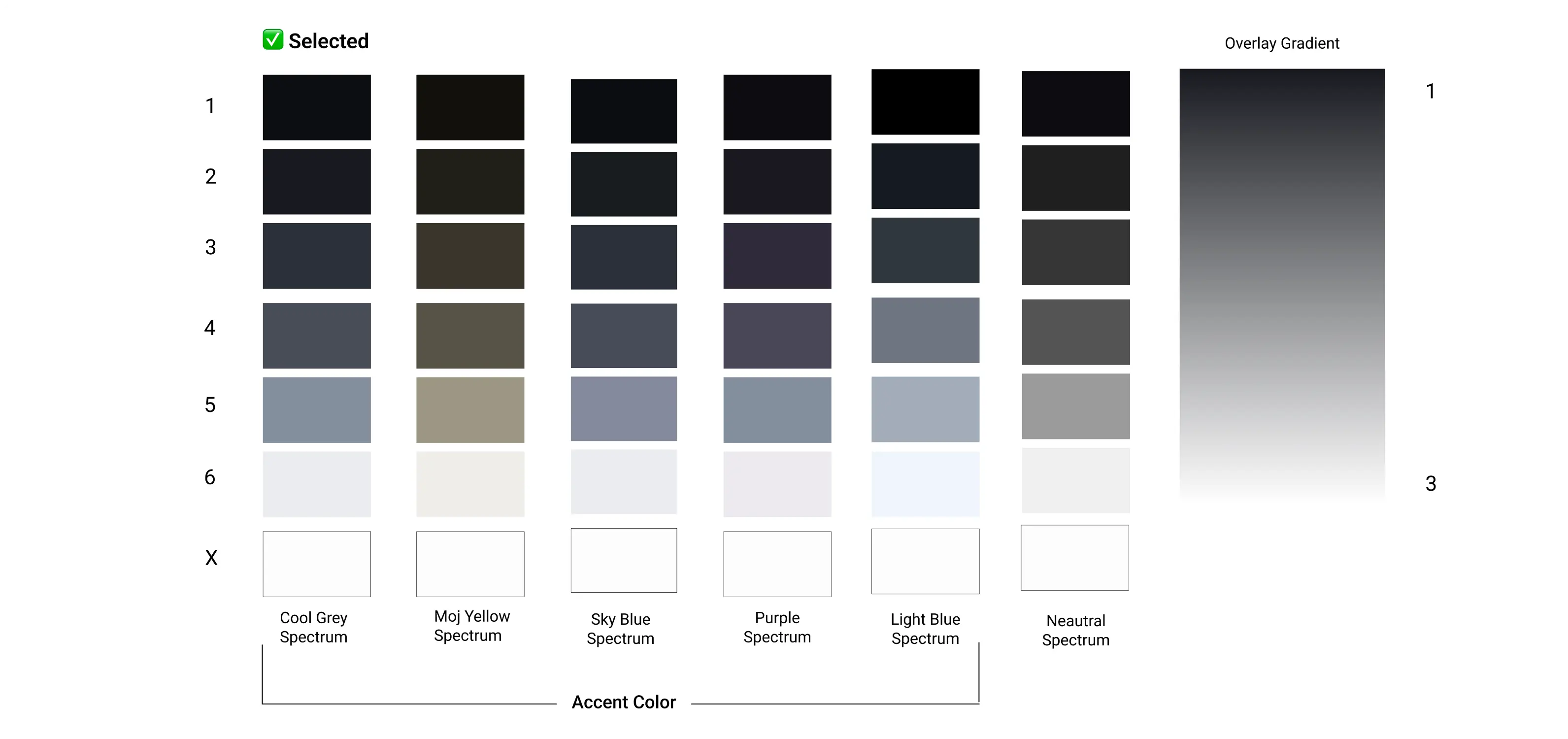
Testing each accent
How
- Each accent was tested with 5-6 unique screens and UI combinations
- Each was tested using 3-4 unique display types (Amoled to IPS LCD technology with variable NITS)
- Semantic tokens and their combinations were also created to in order to maintain maximum accessibility.
Semantic Tokens
To solve the inconsistency, we moved from raw hex codes to Semantic Tokens. This means naming colors by their function rather than their appearance (e.g., using surface-background instead of neutral-900).
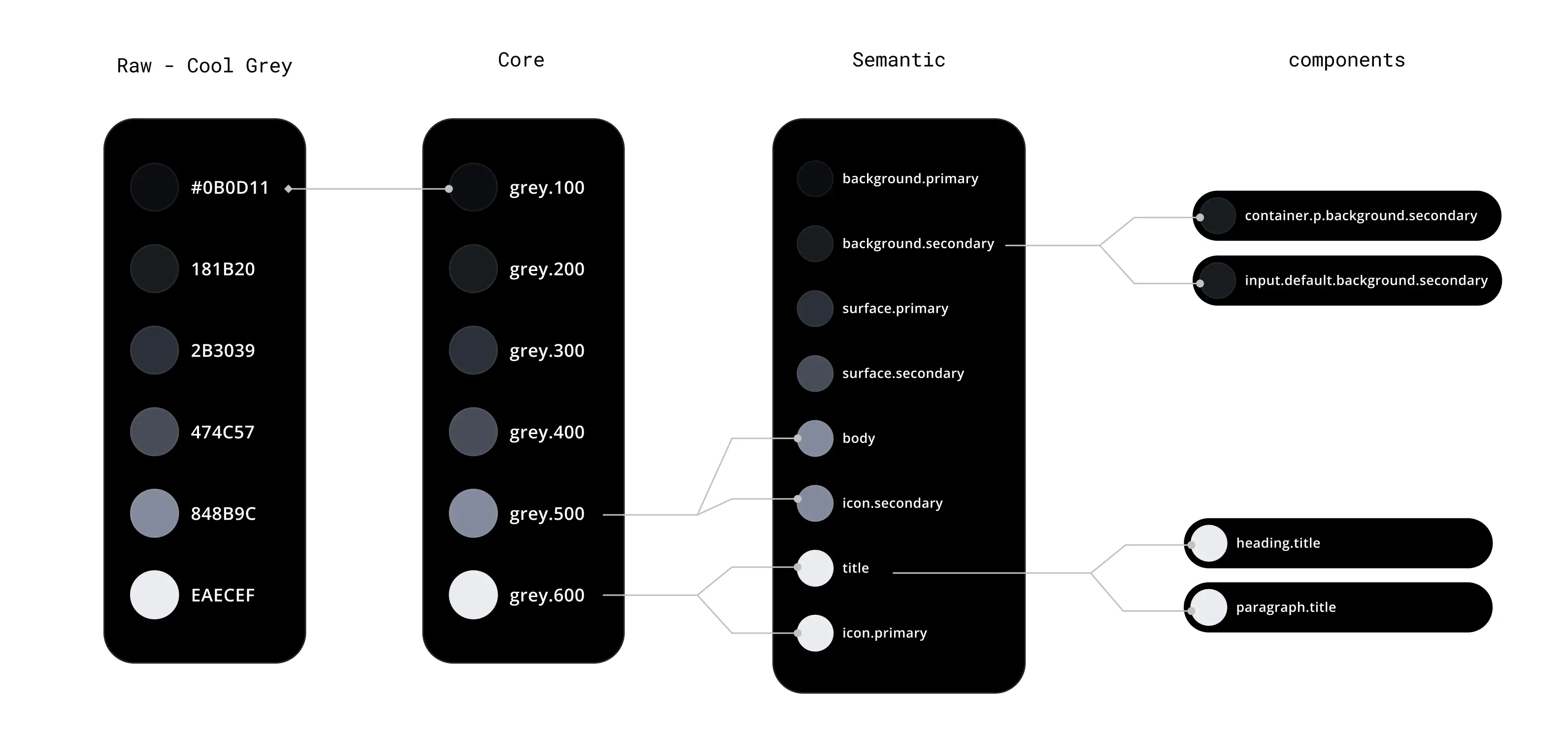
Strategy
Emphasis and Contrast: Instead of using pure white for all text, we utilized opacity and shade variations to create hierarchy:
High Emphasis: For primary titles and active states (Highest contrast).
Medium Emphasis: For secondary text and supporting information (Lower contrast to reduce visual noise).
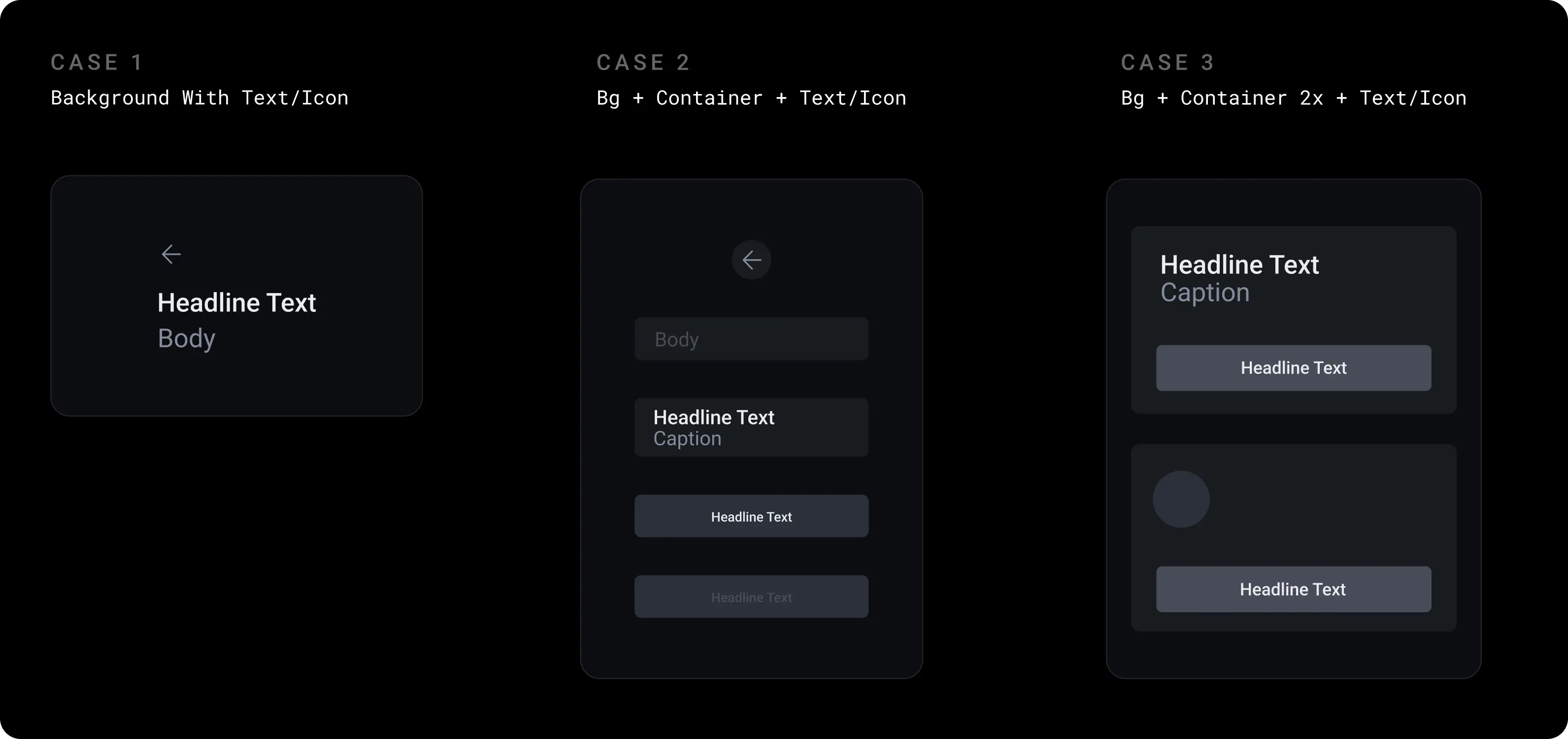
Elevation and Depth (Surface Levels): In Dark Mode, shadows are less visible. We established depth by using lightness levels:
- Level 0-100 (Darkest): The background canvas.
- Level 200 - 400 (Lighter): Cards, modals, and elevated surfaces.
- Level 500-600 (Lightest): Top-level interactions.
- Rule: The higher the surface, the lighter it becomes, mimicking the effect of a light source in a dark room.
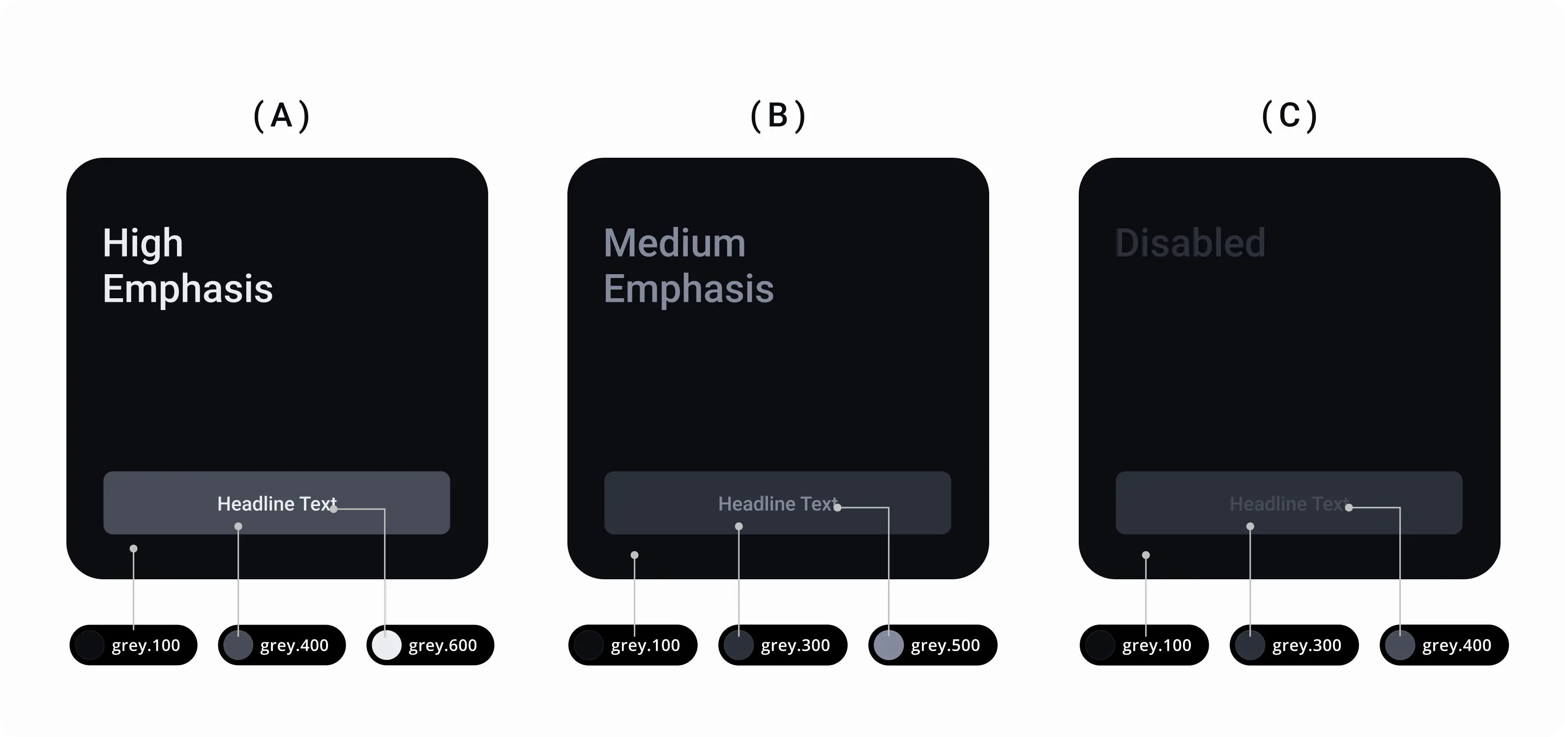
Emphasise and Contrast Levels
Using the combination of grey.100 and grey.200 as a background and foreground creates less depth, if you increase the difference between two numbers ie( grey.100 & grey.300 ) the depth increases. Here you can understand the depth by using point theory.
(A) Represents the highest depth using ( g.100 - grey.400 - grey.600 ). Here the contrast between g.100 & g.400 is 2 point and between g.400 & g.600 is also 2 points thus it is more highlighting.
(B) Represents the Medium depth using ( g.100 - g.300 - g.500 ). Here the gap between g.100 & g.300 is 1 point thus it is balanced.
(C) Represents least depth using ( g.100 - g.300- g.400 ) here the gap between g.300 & g.400 is 0 point thus it has no depth to it.
Results
By establishing these Primitive and Semantic tokens, we successfully created a Dark Mode that is:
Consistent: Unifies the UI across all screens.
Accessible: Meets contrast standards for diverse user environments.
Efficient: Streamlines the workflow for both design and engineering teams.